Sunday, April 5, 2026

Mother of Exiles

This is another poster I drew for New York Law School. The previous image I posted was intended to attract students and other interested NYLS personnel to attend an entertaining dramatization of the facts in the (fictional) case of Travis Bickle. This poster was not intended to attract persons to attend an evening of entertainment, as such, but to an all-day series of various forums and academic discussions on immigration law. The event was held nearly 21 years ago, the topic then primarily a matter of legal and academic (literally) interest, but today a matter of more intense wide-spread attention, passion, and polar opinion than has been the case for many decades.

Thursday, February 12, 2026

Taxi Driver MY WAY!

I hadn't posted anything to this blog in 12 months, and when I tried last month to add something new, I could not! It seemed as if my access to the blog had been lost, other than merely viewing it. Well...several weeks of frustration and resignation later, I'm here, back again with a new entry! What did I do? Between changing my password and trying several of my gmail.com addresses to determine the correct one attached to this blog, somehow--I dunno how--fixed it! Hooray! Now, to business: This is a poster I made nearly 20 years ago. I worked at a law school in NYC and they periodically mounted one-night "plays" in which matters of law were dramatized. This one, obviously, was a trial for Travis Bickle, the homicidal movie taxi driver portrayed by Robert De Niro. On the day the drama would be presented, the poster would be displayed outside the school auditorium where the dramatization would be held. I had been called on several previous times to provide such posters for other similar one-night plays. The posters were intended to attract the attention of any students, faculty, staff, and other persons wandering the school halls. However, the date for this event was postponed...and postponed...and postponed. A key person in mounting these dramas resigned...or was fired...I've never known the real story. I assumed the drama would never be performed, but after months, perhaps even a year they scheduled it. By the time came of the actual event, a newer person who I never met butchered my poster, (in my view), reducing the drawing to a small rectacngle, a mere part of the poster, rather than the entire image. All the neon wordage was removed. Photos and names of the various school students (and professors) performing in the drama filled up four fifths of the new poster. To me it was a great disappointment. They discarded an arresting poster and presented a neutered, dull, instituional promotion. This was (or had been) the best poster I provided for them, and it was my last poster for them. There were no further dramas to follow. (However, some years later, the school's Law Library called on me to provide drawings for flyers they wanted to post in the library elevators. The flyers were intended to provide students with "how to" tips in how to use the library resources effectively and thoroughly. That continued for a few years, and was great fun for me. Perhaps I'll put up some of those pictures here in the future.)

Wednesday, January 22, 2025

Striding Man

Just a drawing I like a lot. It was a short pose, maybe 15 or 20 minutes, give or take. I'm pleased both that this quick drawing is still in a very beginning stage--never to go any further--and yet is as complete as it needs to be. It's a sufficient statement of its own. (As for the name I have given to this drawing: He was standing still, but his stance here is such that it appears as if he might be strolling across the room for the observers drawing him.)

Monday, January 6, 2025

Drawing on tinted paper

Artists sometimes choose to draw or paint on tinted support, (paper, canvas, or other surfaces). This may be to add a certain mood or even drama to the drawing/painting that would otherwise be absent, and/or to allow for laying in highlights with white or other light-colored pigments (yellow, etc.) to create a more robust three-dimensional appearance to the flat images. Artists can also entirely cover the colored support with pigment; the underlying color tone of the paper/canvas may show through or interact with the applied colors, creating an optical mix that results in a richer "mood" or color tone to the finished picture that would be difficult or impossible to achieve otherwise. In my case, in these (and a few other drawings) I wanted to get away from the familiar sameness of drawing on white paper, to experiment with creating a more rounded three-dimensional effect adding dark and light tones to the "mid-tone" of the colored paper. In short, these were exercises. I'm happy with these two drawings, but in the short time I had to work on each drawing, (approx. 2.5 hours each), I could not go as far with the dark/mid-tone/high-light dimensional effects as I might have otherwise.

Monday, November 4, 2024

Preliminary Figure Drawing

This is an unfinished drawing of a standing model. Similar to the two drawings I last posted, this model's back is (somewhat) turned toward me. I laid in the the initial structural foundation for a finished drawing. The drawing is visibly schematic and geometric, with straigt lines and sharp angles, as opposed to the natural roundedness of a living being. This is a manner of setting up a drawing that I adopted many years into my practice of life drawing. Prior to adopting this method, I would take a few minutues to very lightly sketch in the volumes of the body as variably sized circles, elongated ovals, and rounded rectanges. I would then define the figure by drawing the contours of the models' shapes to bring the figure to a finish. I would add modeling ("shading") or not, depending on the time available and if I wanted to go beyond merely linear drawings. I was not a naturally "painterly" draughtsman, (that is, an artist who depicts the subject with broad planes of light and dark tones). I am, by nature, inclined to see and rely on contour lines. However, in the later years of my attending life drawing, the changing instructors tended to set up long drawings--that is, the drawing session would be devoted to drawing from a one long pose, either three to six hours, depending on whether we would be drawing the model for one session or two. In the years prior to that, my instructors tended to have us draw shorter multiple poses in one three hour class, from one minute gesture drawings, to five minute, 10 minute, 15 minute, and 25 minute poses, ending with one 50 minute pose, (with a five minute rest at the midway). With such short poses, I didn't have the time (or inclination) to try to apply more than rudimentary modeling, if any. (I have posted drawings here that are obviously primarily "contour drawings.") With the three- and six-hour poses, I took the time to erect the basic figure, using straight lines and sharp turns to achieve more accuracy in recording the figure. This is a typical way that life drawing is taught. I am of two minds about it. I appreciate the gains in my skill in perception that I acquired in adopting this schematic approach, but I feel that I lost, to a degree, the natural, "living" quality that I see in my earlier drawing. Also, there is a pleasure in just "knocking it out," and producing a satisfactory drawing. It feels more spontaneous, like playing, as opposed to the methodical "work" of building the figure from the foundation up, step by step. That said, I am pleased with this unfinished "schematic" drawing. (I had been drawing the model as the instructor was lecturing, and the pose was not intended to be resumed after the 20 or 25 minutes lecture was concluded.) However, I see in my drawing the model's head is too big relative to his body.

Monday, March 11, 2024

Two Backs

I have no memory or documentation to indicate when I drew these two models, but I can tell they were made years apart, with the drawing of the male model being an earlier drawing than the one of the female. I can tell the drawing of the male model was a short-ish drawing, probably 10-15 minutes at most, given its lack of detail. The drawing of the female model took longer, given that I took the time to lay in the shape of the shadow pattern on her figure. However, it is incomplete. It is too schematic for this to have been what would I intended as the final finish. It is fixed in that half-way state been preliminary "blueprint" (so to speak) and completion.

Wednesday, February 28, 2024

Lanky

I can't recall how long this pose was, but given the detail, I'm guessing it was a long pose of 50 minutes, (two 25 minute posing sessions with a 5 minute rest pause for the model). There were longer poses in which the pose would last for the entirety of either one or two drawing classes, (each class duration was 3.5 hours with 5 minute breaks every 25 minutes and one 25 minute long break for the model and the artists). In such cases where the pose lasted for two classes, the model would return to the next class session later in the week or even the next week and resume his or her pose from the previous class. Again, thinking back to my drawing skill at that time and the appearance of this drawing, I'm pretty sure this to have been a 50 minute pose.

Thursday, June 8, 2023

"Vinnie De Milo": On Drawing Casts

Prior to the advent of modern art, the great art academies in Europe, (and those schools in America who modeled themselves on the European academies) typically required students to take classes in cast drawing before moving on to drawing from the live model. A "cast" is a plaster figure of various aspects of human figures: heads, hands, feet, torsos, whole bodies, and even the separate features, (eye, nose, mouth, ear). Students would draw from the casts, illuminated under dramatic lighting to accentuate the shadow shapes and highlighted areas of the object, the more clearly to reveal the form under observation. Students would not be permitted to move on to drawing from the live model until they had developed acceptable perceptual and drawing skill to render accurate drawings of from the casts. Thus, by definition, every student in the life drawing class had developed and demonstrated great facility in close observation and accurate rendering on paper of three dimensional objects. Cast drawing came to be disdained as "modern art" appeared, (beginning with the Impressionists in France), and young students came to find cast drawing dull and stifling, (notwithstanding their efficacy as tools for developing acute skill in rendering three dimensional forms accurately). In recent years, a vogue has developed of young artists seeking out art schools and ateliers* teaching the "antique" skills of representational drawing, including classes in cast drawing. *(Ateliers are small artist-run studios where students learn under close tutelage, often by one or a few artists who run the atelier. The teaching is in the mode of master/apprentice training.) I took life drawing classes at the Art Students League of New York for nearly 30 years. The League teaches classes in traditional figure drawing and painting, as well as sculpting, but it also includes many classes in abstract and non-representational art. It was founded in the 19th Century by art students in New York who rejected the traditional teaching style modeled on the European academies. I generally only drew from the models, but there were rare occasions where either the model was late arriving or I was uninterested in drawing the model for some reason. On a couple of such occasions I drew from the (somewhat larger than life size and very dusty) full-figure drawing cast that had been a fixture in the studio for decades, probably as far back as the League's 19th Century founding. I have posted two of those drawings here: a frontal view and a rear view. I did not attempt to draw them with the close attention and exacting fidelity that was expected of students in cast drawing classes. Such drawings required hours (spanning days) of slow and deliberate drawing by the students. (And, frankly, I have not developed the skills necessary to produce such finished "academic" cast drawings.) I did these both rather swiftly, probably no longer than 30 minutes on either drawing. I used charcoal to draw the frontal view and a pencil to draw the rear view.

Thursday, April 6, 2023

Reclining Woman

This is a 15 minute sketch of a clothed model. After drawing literally thousands of nudes, it is really tons o' fun to draw from the clothed, or "draped" figure. I can't recall if this was drawn in one of the drawing classes I attended at the Art Students League of NY, or if it was was drawn in a private sketch session. I and a group of students at the League would periodically hire models from the League to pose for us in private sessions held in a rotating series of sketch members' apartments. (I'm sure there were other students not part of our group who were doing the same thing.) Typically, in the private sessions the models would pose nude, as they did at the League. This leads me to think this was drawn at the League, but in a circumstance where the paid model was tardy and a student would volunteer (or be asked) to pose until the model arrived. This was extremely rare, but I can recall it occurring at least a couple of times. In any case, this quick sketch is among those drawings I am most pleased with out of tens of thousands of drawings (from nearly 30 years of life drawing). I would love to return to life drawing, but there is no easy access to life classes in my current location.

Friday, September 9, 2022

aCiD tRiP dRaWiNg

This is an interruption of my plans to post more of my life drawings. The title of this post and the comment scribbled on the image is...'nuff said!

Thursday, May 5, 2022

Life Drawing, continued.

Here are more one minute poses, although I believe the first page of the male model may be five minute poses...though I'm not certain. They could also be one minute poses. I'll be posting more one minute drawings throughout, as I find those to be the most satisfying to me...in the ones where I am happy with how I captured the action. I will, also, post some longer, more finished drawings in future supplments.

Thursday, April 28, 2022

Life Drawing

I spent clost to 30 years taking life drawing classes at The Art Students League of NY, a wonderful institution open to all who wish to take classes in drawing, painting, sculpturing, printmaking, etc. In its nearly 150 years' exitence, many renowned commercial and fine artists have taught and studied there, from Norman Rockwell to Jackson Pollock and countless more. I will begin posting here and in following posts a small selection of the mere fraction I kept of the tens of thousands of drawings I drew in my years there. These first few are all one minute sketches, which trains the artist in quickly seeing and capturing the action of the model. I will post some more finished drawings in future posts.

Sunday, October 27, 2019

Self Portrait(s)

I said below I had not drawn a self-portrait of myself since shaving my beard 14 years ago. I overlooked this most recent drawing, made a few months ago. This is a portrait of myself and my wife Joanne, which I drew to appear on our Thank You cards to our friends and family. We were "made into one" six months ago, in April 2019. Joanne and I met 17 years ago and became great friends. Who knew I would end up marrying my best friend? We have a blended family, with our beloved Sophie making it complete.

Self-Portrait 3

This is the very first self-portrait I ever made, as described in the preceding post. I was 24. In retrospect, given how little "serious" drawing I had ever done at this time, (as opposed to bad cartoon drawings), I am surprised at how well-done it appears to me. There are some issues with proportion. I'm not sure if there's too much forehead or too little jaw...it's possibly both! This shows one characteristic of my drawing that remains consistent to this day: I draw linearly, rather than tonally, (which involves depicting the form through its masses, built up by broad, painterly use of charcoal, pastel, or soft pencil). This was drawn with a fairly hard pencil, 4F. The harder the pencil, the longer the point remains sharp, and the less the graphite smears. A drawing teacher I had once said that most artists tend naturally toward depicting form by one means or the other: through line or tone. She recommended that we practice drawing in whichever manner was NOT natural to us, in order to expand our ways of seeing and drawing. Good advice, which I have not put into practice nearly enough.

Self Portrait 2

This self-portrait predates the one in the previous post titled "Self Portrait 1." This was drawn as an assignment in a life-drawing class I was taking at the Art Students League of NY. It was only the second "realistic" self-portrait I had ever drawn, though I had drawn myself many times in cartoon form in my sketchbooks. I drew one previous "serious" self-portrait prior to this many years before, when, having graduated college, I contemplated applying to the Ringling School of Art in Sarasota, Florida. Their application requirements included providing several pieces of art, one of which was a self-portrait. (I will post that here in a separate post.) I was living in Florida at the time and trying to decide what to do with myself. In the end, I didn't apply to the Ringling School, and I moved to New York City, (following two college friends of mine). Here, I enrolled in the Art Students League and took life drawing classes there for 25 years.

After this drawing, I have made several other self-portraits, all during the years when I had a beard. I haven't drawn myself since shaving my beard almost 14 years ago. I think it's time I have a go at it.

Self-Portrait 1

This is a self-portrait in graphite and white crayon from some years ago, when I still had a beard. I was inspired to make this drawing after looking at some abstract paintings by Richard Pousette-Dart. In these particular paintings, Pousette-Dart had combined white paint with ghostly gray pencil marks that produced a beautiful, mysterious effect. I am not an abstractionist, but I wanted to emulate Pousette-Dart's effects, so I did the expedient thing and drew myself in soft graphite. I then rubbed over the graphite with white wax crayon. The effect is nothing like Pousette-Dart's, but I like it pretty well.

Tuesday, July 3, 2018

The Tragedy In My Neighborhood


In 2005, a young man working as a temp was assigned to our office. He was bright and enthusiastic, and at some point he told me he and his brother were gathering material to publish a humor magazine, which they planned to title ODDFELLOW, (named after an actual fraternal group with a long history). This came up in the context of our talking about my drawings, as I doodled all over the desk calendar and on any other scraps of paper on my desk. He asked me if I would be interested in contributing some drawings for a story they were publishing. I  said "Yes!" I also recommended they contact my friend Danny Hellman, a professional illustrator who began his career (as have many others of repute) drawing covers for the infamous SCREW Magazine, (actually, a tabloid newspaper published weekly in NYC). I gave him Danny's contact information, (and they did end up obtaining some work from him). Shortly after, the young man gave me the manuscript of a short story called "The Tragedy In My Neighborhood," a sharp little tale of suburban alienation, by Ken Cormier. The tale's narrator seems to be having psychological problems that cause him sleepless nights, compulsive writing of his thoughts, and crying jags at work. In fact, the story is told in the form of one of the narrator's journal entries. One night he witnesses his neighbor commit an act of arson. The next day at work, a new man at work is marched out of the office by the police for an unknown offense. He points accusingly at the narrator.

At this same time, I had become enamored with the graphic work of Swiss illustrator and cartoonist Thomas Ott. Ott works in the medium of scratchboard to powerful effect, and his drawings are dramatic and beautiful. I wanted to emulate his approach, and I thought this story would provide the perfect opportunity. I didn't want to use actual scratchboard, as I feared I would immediately botch the work, as I have no experience working with scratchboard. However, I did use PAINTER, computer software that emulates natural media, to do the work. First, I made the underlying drawings in pencil, and then scanned them into the computer. I opened each drawing in PAINTER in turn, and filled a layer over each image with black, reduced the opacity so I could see through to the underlying sketch, and drew with a white line, digitally carving away the black to reveal the image. These images are the results.

As my first attempts, I'm varibly happy with three of them.  The first image shows the many pages of the narrator's writings pasted on his wall, (perhaps obscuring a window to another view, a view outside his room). This is a way of showing the obsessive thoughts beclouding his consciousness. The image of the man sitting watching his house burn is a failure, in my view. It's stiffly drawn and awkwardly composed, and lacks all the drama such an image should have had. I'm most pleased with the drawing of the pointing man being taken away as the narrator watches from the left foreground. I think my first use of the scratchboard technique is adequate, but it is my underlying drawings that are uneven. But then, I look at Thomas Ott's earliest works and they are clumsy in their drawing and technique, as well. One has to begin somewhere.

The first issue of ODDFELLOW was published in Fall 2005 and contained the story with my accompanying illustrations. A second issue was published a few months later, with another short piece by Ken Cormier, which I illustrated with a single panoramic picture spanning both sides of the top of a double-page spread. I used the same faux-scratchboard style for that, and I may put it up here at some point. The third, and final issue of ODDFELLOW was meant to be the "Spring 2006" issue, hence, my cover illustration--which you can find here on this blog along with several preparatory drawings in a post titled "Dance of the Oddfellows"--a modern rendering of Stravinsky's "Rite of Spring." However, the issue was delayed and not published until the Fall of 2006, so the point of the cover drawing may was obscured, if not entirely lost.

Sunday, May 27, 2018

Pseudo Hobo Boho
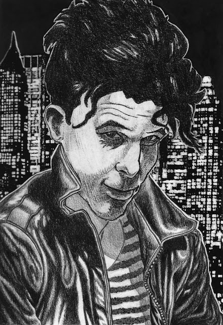
This is a drawing of Tom Waits that was published in a rock 'zine called THE VILLAGE NOIZE back in the 90s. For a period of time I had a one page comic in every issue for about 5 or 6 issues. The 'zine was a labor of love by its editor and came out irregularly, maybe twice a year, at most. It did appear on select newstands around NYC, and on the magazine shelf at Tower Books. I had drawn a portrait of Waits in my sketchbook, strictly as a portrait exercise, as I have never liked Waits' work. From the first time I heard and saw him, he struck me as someone aping the vocal mannerisms and dress of older black jazz hepcats, along with a heaping of faux-hobo-isms. It all seemed very self-conscious. I like Captain Beefheart very much, a similar vocalist (of very different music), in that his singing is very a pastiche of Howlin' Wolf's style. However, Beefheart was able to incorporate Wolf's timbre and mannerisms into his own singing and produce something genuine to him. With Waits, I've never NOT heard his singing as mere mimicry of his betters. Beyond that, it seems maudlin and caricatured, just a form of minstrelsy. My title for this post expresses my feelings about Waits.

In any case, the editor of THE VILLAGE NOIZE was doing an article on Waits and he asked me if I could provide a drawing to accompany the article. At first I thought I would draw a brand new portrait, but I hit upon the idea of making a copy of the sketchbook head portrait, and pasting it onto a separate new drawing of the upper half of a male torso in black leather...and so, voila! For the backdrop, I photocopied a black and white photo of the Manhattan skyline a few times to make it more graphic black and white, and I pasted that behind the figure in the foreground. This was all done by hand, as I did not have Photoshop, or even a computer, at the time I drew this. The head and leather jacket are drawn with a black Prismacolor pencil; the striped t-shirt was achieved by laying down strips of Liquid Friskit, which dries to a rubbery consistency, and then spattering ink with a tooth brush over the area. When the ink dried, I rubbed the dried, rubbery Liquid Friskit off the paper, and underneath those areas remained white. I think the end result is reasonably successful.

Thursday, May 17, 2018

Urban Plight

This is a comic strip I drew over the course of my first couple of years living in New York. The story was inspired directly by the alienation I felt being in this big, strange, overwhelming city where I wanted to be but where I didn't feel at home. I felt intimidated by many of the rough, odd-looking people on the streets and subways...but then I thought of all the spree-killers who were "quiet, well-behaved, would-never-hurt-a-fly" type fellows, and I thought: "Maybe these people are afraid of ME!"

The story was originally published in two parts in RED TAPE, a literary/art zine published on the Lower East Side throughout the 80s and into the dawn of the 90s. This Wikipedia page provides some info, including some of the prominent contributors to the magazine:

https://en.wikipedia.org/wiki/Redtape_Magazine

I've been in New York for 37 years now, and it long ago came to feel like home.


Sunday, January 22, 2017

NYC 1980s Punkers

I knew a girl at work whose brother played bass for MURPHY'S LAW, a NYC hardcore punk band big in the 80s. She said they were looking for an artist to draw an album cover for them, and she asked me if I were interested. I was, and the band asked her to have me provide samples of my drawings. This is one that I sent to them. I can't recall if I sent anything else, but this drawing scotched my chance to draw their album cover. I made this sketch by drawing people from two photos in an article in NEW YORK Magazine about the NY hardcore scene. Apparently, someone in the band had a beef with one or both of these people in real life, and my having randomly chosen to draw them incurred his displeasure.  (I wasn't interested in the NY hardcore scene--or hardcore in general--so I was not familiar with the band's music or any of the internecine politics of the scene.)

Later, on a band trip to Los Angeles, the band member who was my work colleague's brother was stabbed to death in a completely random street encounter with a couple of young toughs.