
Thursday, June 26, 2014
We the People...
Saturday, June 7, 2014
Brushy Face

This Ben Shahn-like drawing was just a quick doodle. I like it because of its expressive brushy lines, but it was not drawn with a brush. This was drawn digitally, with a Wacom tablet, using a Creaturehouse EXPRESSION, a wonderful vector program that was bought by Microsoft and turned into a component of Windows-only website building software suite. Microsoft discontinued the product a couple of years or so ago, but I can only use the original software, which was compatible with Macs. The program has its own complement of prepackaged brushes, as expected, but one could make marks on paper with pen, brush, ink drops, etc., then scan them in and use them to make unique vector brushes that were responsive to pressure sensitivity, allowing for variability of line weight. This was drawn with a brush I made. The program was much cheaper than Illustrator or equivalent programs, and was far easier to use out of the box, very intuitive, and far more conducive to making expressive, "natural" drawings. It didn't have, perhaps, the "power" of Illustrator, but it was the better tool for simulating natural media, but with the advantages of vector capabilities. (The two cartoons in my post "Harry Potter Conquers The Universe" were drawn with EXPRESSION, over scanned in pencil underdrawings.)
Will anyone rescue EXPRESSION from the digital grave?
Saturday, May 31, 2014
Harry Potter Conquers The Universe


Two pictures I drew for The Brutarian, fanzine dedicated to trash culture, (monster movies, rock music, exploitation films, etc.) The Brutarian ran for quite a few issues and received wide distribution, in that Tower Records carried it in their magazine section.
This article had to do with the popularity of fantasy and sf in popular culture, as best I can recall. The first illustration here is titled "Harry Potter Conquers The Universe." (Could that have been the title of the article? Maybe.) The second illustration depicts interstellar love, (although, as so often on Earth, the love appears a bit one-sided). This is titled "Lunar "L'amour."
Saturday, May 17, 2014
Flayed Head

This is an ink wash and gouache drawing of a plastic head ecorche I have, cast from a cadaver's head. The other side of the ecorche is just the skull, so one may see and compare the bony structure under the musculature. The gouache was a happy accident; I intended only for this to be an ink wash rendering, but I laid down an area of wash that was darker than I intended. Not knowing how best to correct the error, I went over that section with a thin layer of white gouache, hoping to lighten the ink. I succeeded in my intent, at least partly, but I was surprised to find I liked the look of the gouache over the ink. After I competed the rest of the ink wash layers, I went over everything with the gouache.
Friday, May 2, 2014
Dance of the Oddfellows

Here's the final picture, used as the cover drawing for issue #3 of Oddfellow, a humor magazine published out of NYC. This was the "Spring Issue," (a hint to the theme of the image), and also the final issue to be published. It was a joint effort by two brothers, the younger of whom I met when he was temping at my place of work. When he told me he and his brother were planning on publishing their own magazine, I recommended they contact a friend of mine, a professional illustrator, to do some work for them, which they did, and which he did. They also asked me to contribute, flatteringly enough. I provided four interior drawings illustrating a story in their first issue, a single doublewide drawing (it ran across the top half of two pages inside) for another story in their second issue, and this cover drawing and an interior comic strip for this final issue. The interior strip was written by the publisher and was an advertisement for a music store in NYC. (I generally write my own comics--not that I have produced a surplus of them--and only twice previously had I ever illustrated someone else's script.)
This incorporates elements that I drew separately (as shown in the previous several posts), then put together digitally in Corel Painter, (with some tweaking in Photoshop). For a closer look, click on the picture, (as with all pictures posted on this blog). This is an upload of the tif file of the finished illustration, and not a scan of the published cover.
Saturday, April 26, 2014
Dancers Dancing, (Discarded)


Initially, I thought I would try rendering the finished cover in a block cut style, (digitally "cut," however). I completed these test renderings of three figures before discarding the idea. I concluded it would be too time consuming to treat each element in the picture in this style, and I wasn't even sure I liked it. I was afraid I would expend effort and time and, in the end, be unhappy with the final result. In retrospect, I really like this faux block print look, and I wonder now how the picture would have turned out if I had continued with this approach.
I'll publish the actual finished picture in my next post.
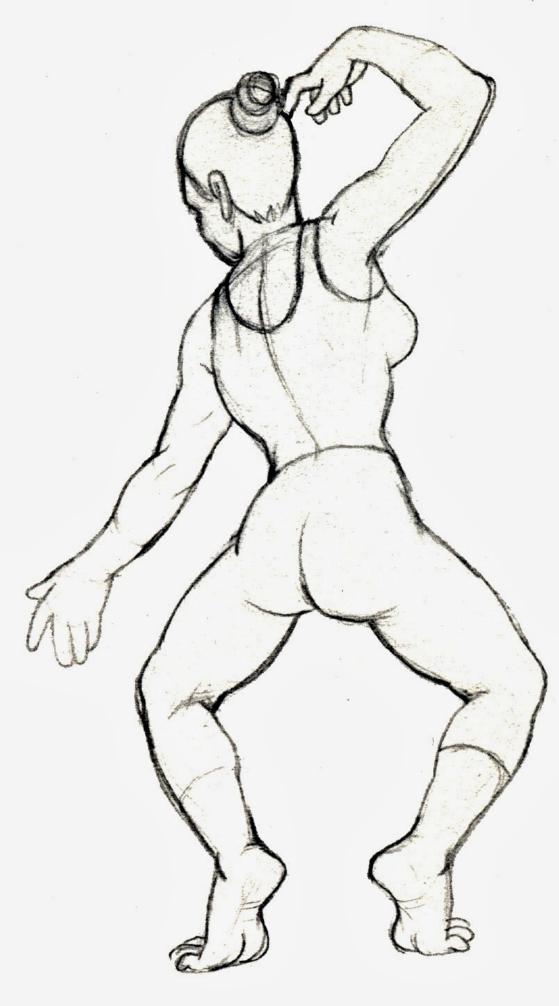
Saturday, April 12, 2014
Dancers Danc--uh, where are the dancers?!


Here are a few more pencil sketches of elements that were part of the final cover illustration. The next post will include some finished renderings of some of the dancers that I ultimately did not use.
Sunday, April 6, 2014
Dancers Dancing, Part Two


Here are more pencil sketches of dancers for the aforementioned cover illustration for the short-lived NYC-based humor magazine. In the next part of this series, I'll share some more elements that comprised the final result, and some first attempts at finished renderings over the pencil sketches. After that...the big picture!
Friday, March 28, 2014
Dancers Dancing, Part One


These are pencil sketches for what became the cover illustration of a short-lived humor magazine published out of NYC in the late oughts of the 21st century. In my next posts, I will upload more sketches and a couple of preliminary-but-discarded tryout treatment drawings for the finished illustration, (which I will put up at the end of this short series).
Tuesday, March 11, 2014
Spaceman Blues

This spaceman is in a thrice-fold predicament...adrift between the planets...losing oxygen...bedeviled by mysterious creepy-crawlies swarming inside his spacesuit. I wouldn't want to be in his skin.
Saturday, March 8, 2014
Harry

Harry, a professional artist's model. I drew this in life class a few years ago. I used a fairly hard, light pencil, so I adjusted the levels of light and dark in Photoshop to make the reproduced image a bit more dynamic.
Friday, March 7, 2014
Colorforms World

This was a little experiment, a bit of whimsy. The title of this post refers to the old childhood art toy that I had as a child.
Tuesday, March 4, 2014
A Tough Customer, Three Times


This shows the development of a sketchbook doodle from its original state, (long sleeves, no birds), to its second state, (black tank top, birds), and then to its final state, (long sleeves return, birds gone, color added). The third version, one might notice, has thicker, brushier lines than the previous images. I used Adobe's Streamline to autotrace the first sketch, transforming it into vectors; I then applied a stroke to it in the wonderful little vector graphics program EXPRESSION, by CreatureHouse. Microsoft bought the program in 2002 or so, took it off the market for a bit, and brought it back as part of their EXPRESSION Suite, intended for web-building. It was discontinued by Microsoft a year or so back. Microsoft did not develop it for the Mac, and so I retain CreatureHouse's app on my Mac for occasional use. I wish the original developers would buy back the rights and reintroduce it to market. It is/was much simpler and more intuitive to use than Illustrator, and it could produce more natural-looking artwork...and it was just plain fun to use.
Sunday, March 2, 2014
Army (Jacket) Days

This is another sketchbook drawing done without a pencil preliminary. I used a fine tip marker to draw this army field jacket, which served as my winter coat for a couple of seasons.
Friday, February 28, 2014
Zap Attack

Here is a link to the original image, for those who have not seen it:
http://marswillsendnomore.files.wordpress.com/2013/04/zap-comix-0-robert-crumb-2.jpg
Subscribe to:
Posts (Atom)