Thursday, April 28, 2022

Life Drawing

I spent clost to 30 years taking life drawing classes at The Art Students League of NY, a wonderful institution open to all who wish to take classes in drawing, painting, sculpturing, printmaking, etc. In its nearly 150 years' exitence, many renowned commercial and fine artists have taught and studied there, from Norman Rockwell to Jackson Pollock and countless more. I will begin posting here and in following posts a small selection of the mere fraction I kept of the tens of thousands of drawings I drew in my years there. These first few are all one minute sketches, which trains the artist in quickly seeing and capturing the action of the model. I will post some more finished drawings in future posts.

Sunday, October 27, 2019

Self Portrait(s)

I said below I had not drawn a self-portrait of myself since shaving my beard 14 years ago. I overlooked this most recent drawing, made a few months ago. This is a portrait of myself and my wife Joanne, which I drew to appear on our Thank You cards to our friends and family. We were "made into one" six months ago, in April 2019. Joanne and I met 17 years ago and became great friends. Who knew I would end up marrying my best friend? We have a blended family, with our beloved Sophie making it complete.

Self-Portrait 3

This is the very first self-portrait I ever made, as described in the preceding post. I was 24. In retrospect, given how little "serious" drawing I had ever done at this time, (as opposed to bad cartoon drawings), I am surprised at how well-done it appears to me. There are some issues with proportion. I'm not sure if there's too much forehead or too little jaw...it's possibly both! This shows one characteristic of my drawing that remains consistent to this day: I draw linearly, rather than tonally, (which involves depicting the form through its masses, built up by broad, painterly use of charcoal, pastel, or soft pencil). This was drawn with a fairly hard pencil, 4F. The harder the pencil, the longer the point remains sharp, and the less the graphite smears. A drawing teacher I had once said that most artists tend naturally toward depicting form by one means or the other: through line or tone. She recommended that we practice drawing in whichever manner was NOT natural to us, in order to expand our ways of seeing and drawing. Good advice, which I have not put into practice nearly enough.

Self Portrait 2

This self-portrait predates the one in the previous post titled "Self Portrait 1." This was drawn as an assignment in a life-drawing class I was taking at the Art Students League of NY. It was only the second "realistic" self-portrait I had ever drawn, though I had drawn myself many times in cartoon form in my sketchbooks. I drew one previous "serious" self-portrait prior to this many years before, when, having graduated college, I contemplated applying to the Ringling School of Art in Sarasota, Florida. Their application requirements included providing several pieces of art, one of which was a self-portrait. (I will post that here in a separate post.) I was living in Florida at the time and trying to decide what to do with myself. In the end, I didn't apply to the Ringling School, and I moved to New York City, (following two college friends of mine). Here, I enrolled in the Art Students League and took life drawing classes there for 25 years.

After this drawing, I have made several other self-portraits, all during the years when I had a beard. I haven't drawn myself since shaving my beard almost 14 years ago. I think it's time I have a go at it.

Self-Portrait 1

This is a self-portrait in graphite and white crayon from some years ago, when I still had a beard. I was inspired to make this drawing after looking at some abstract paintings by Richard Pousette-Dart. In these particular paintings, Pousette-Dart had combined white paint with ghostly gray pencil marks that produced a beautiful, mysterious effect. I am not an abstractionist, but I wanted to emulate Pousette-Dart's effects, so I did the expedient thing and drew myself in soft graphite. I then rubbed over the graphite with white wax crayon. The effect is nothing like Pousette-Dart's, but I like it pretty well.

Tuesday, July 3, 2018

The Tragedy In My Neighborhood


In 2005, a young man working as a temp was assigned to our office. He was bright and enthusiastic, and at some point he told me he and his brother were gathering material to publish a humor magazine, which they planned to title ODDFELLOW, (named after an actual fraternal group with a long history). This came up in the context of our talking about my drawings, as I doodled all over the desk calendar and on any other scraps of paper on my desk. He asked me if I would be interested in contributing some drawings for a story they were publishing. I  said "Yes!" I also recommended they contact my friend Danny Hellman, a professional illustrator who began his career (as have many others of repute) drawing covers for the infamous SCREW Magazine, (actually, a tabloid newspaper published weekly in NYC). I gave him Danny's contact information, (and they did end up obtaining some work from him). Shortly after, the young man gave me the manuscript of a short story called "The Tragedy In My Neighborhood," a sharp little tale of suburban alienation, by Ken Cormier. The tale's narrator seems to be having psychological problems that cause him sleepless nights, compulsive writing of his thoughts, and crying jags at work. In fact, the story is told in the form of one of the narrator's journal entries. One night he witnesses his neighbor commit an act of arson. The next day at work, a new man at work is marched out of the office by the police for an unknown offense. He points accusingly at the narrator.

At this same time, I had become enamored with the graphic work of Swiss illustrator and cartoonist Thomas Ott. Ott works in the medium of scratchboard to powerful effect, and his drawings are dramatic and beautiful. I wanted to emulate his approach, and I thought this story would provide the perfect opportunity. I didn't want to use actual scratchboard, as I feared I would immediately botch the work, as I have no experience working with scratchboard. However, I did use PAINTER, computer software that emulates natural media, to do the work. First, I made the underlying drawings in pencil, and then scanned them into the computer. I opened each drawing in PAINTER in turn, and filled a layer over each image with black, reduced the opacity so I could see through to the underlying sketch, and drew with a white line, digitally carving away the black to reveal the image. These images are the results.

As my first attempts, I'm varibly happy with three of them.  The first image shows the many pages of the narrator's writings pasted on his wall, (perhaps obscuring a window to another view, a view outside his room). This is a way of showing the obsessive thoughts beclouding his consciousness. The image of the man sitting watching his house burn is a failure, in my view. It's stiffly drawn and awkwardly composed, and lacks all the drama such an image should have had. I'm most pleased with the drawing of the pointing man being taken away as the narrator watches from the left foreground. I think my first use of the scratchboard technique is adequate, but it is my underlying drawings that are uneven. But then, I look at Thomas Ott's earliest works and they are clumsy in their drawing and technique, as well. One has to begin somewhere.

The first issue of ODDFELLOW was published in Fall 2005 and contained the story with my accompanying illustrations. A second issue was published a few months later, with another short piece by Ken Cormier, which I illustrated with a single panoramic picture spanning both sides of the top of a double-page spread. I used the same faux-scratchboard style for that, and I may put it up here at some point. The third, and final issue of ODDFELLOW was meant to be the "Spring 2006" issue, hence, my cover illustration--which you can find here on this blog along with several preparatory drawings in a post titled "Dance of the Oddfellows"--a modern rendering of Stravinsky's "Rite of Spring." However, the issue was delayed and not published until the Fall of 2006, so the point of the cover drawing may was obscured, if not entirely lost.

Sunday, May 27, 2018

Pseudo Hobo Boho

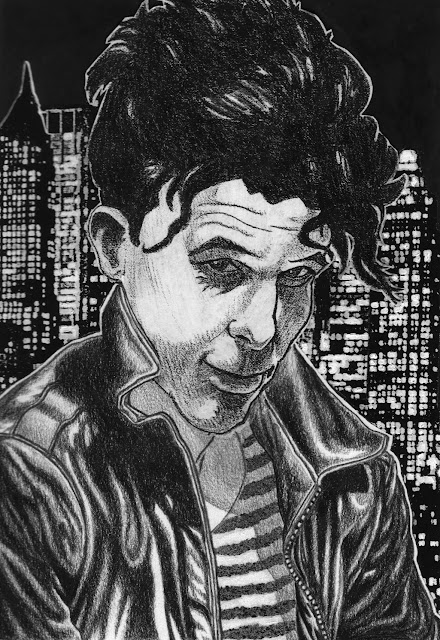
This is a drawing of Tom Waits that was published in a rock 'zine called THE VILLAGE NOIZE back in the 90s. For a period of time I had a one page comic in every issue for about 5 or 6 issues. The 'zine was a labor of love by its editor and came out irregularly, maybe twice a year, at most. It did appear on select newstands around NYC, and on the magazine shelf at Tower Books. I had drawn a portrait of Waits in my sketchbook, strictly as a portrait exercise, as I have never liked Waits' work. From the first time I heard and saw him, he struck me as someone aping the vocal mannerisms and dress of older black jazz hepcats, along with a heaping of faux-hobo-isms. It all seemed very self-conscious. I like Captain Beefheart very much, a similar vocalist (of very different music), in that his singing is very a pastiche of Howlin' Wolf's style. However, Beefheart was able to incorporate Wolf's timbre and mannerisms into his own singing and produce something genuine to him. With Waits, I've never NOT heard his singing as mere mimicry of his betters. Beyond that, it seems maudlin and caricatured, just a form of minstrelsy. My title for this post expresses my feelings about Waits.

In any case, the editor of THE VILLAGE NOIZE was doing an article on Waits and he asked me if I could provide a drawing to accompany the article. At first I thought I would draw a brand new portrait, but I hit upon the idea of making a copy of the sketchbook head portrait, and pasting it onto a separate new drawing of the upper half of a male torso in black leather...and so, voila! For the backdrop, I photocopied a black and white photo of the Manhattan skyline a few times to make it more graphic black and white, and I pasted that behind the figure in the foreground. This was all done by hand, as I did not have Photoshop, or even a computer, at the time I drew this. The head and leather jacket are drawn with a black Prismacolor pencil; the striped t-shirt was achieved by laying down strips of Liquid Friskit, which dries to a rubbery consistency, and then spattering ink with a tooth brush over the area. When the ink dried, I rubbed the dried, rubbery Liquid Friskit off the paper, and underneath those areas remained white. I think the end result is reasonably successful.